Product Design

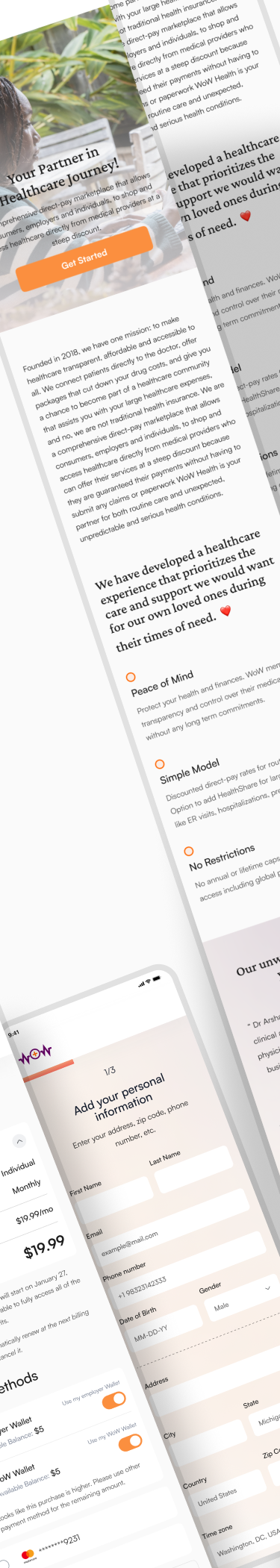
Wow Health is a healthcare product from the United States. They started developing it in 2018, but they didn't pay enough attention to how easy it is for people to use and how it looks. It's a tool that helps doctors, nurses, and assistants book medical appointments, keep track of them on a calendar, make vouchers and coupons, and do other useful things
Yet, there were some problems that made the product less enjoyable for users. In this project, our main aim was to find these problems, update the way it looks, add new features, and make sure users are happy. This case study will show you how we tackled these issues and improved the software.


I was a mid-level designer on the Tangent team, where I worked closely with engineers, stakeholders and the QA team to ensure the product's quality.
During the redesign, we talked a lot about what needed to be done. We had many meetings to look at our user data and see where we were falling behind compared to our competitors. We quickly made changes to address these issues. It was a big challenge for our team because we were shifting from a focus on consumers (B2C) to businesses (B2B)
Surface relevant actions & information to empower self-service in solving questions, managing problems and reducing customer support request.
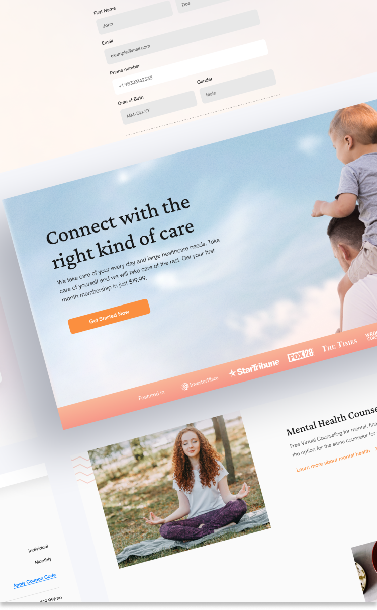
Our primary goal was to enhance the user experience by enabling users to schedule appointments instantly, while also focusing on creating a smooth and seamless overall experience.
Research
Analysis & Planning
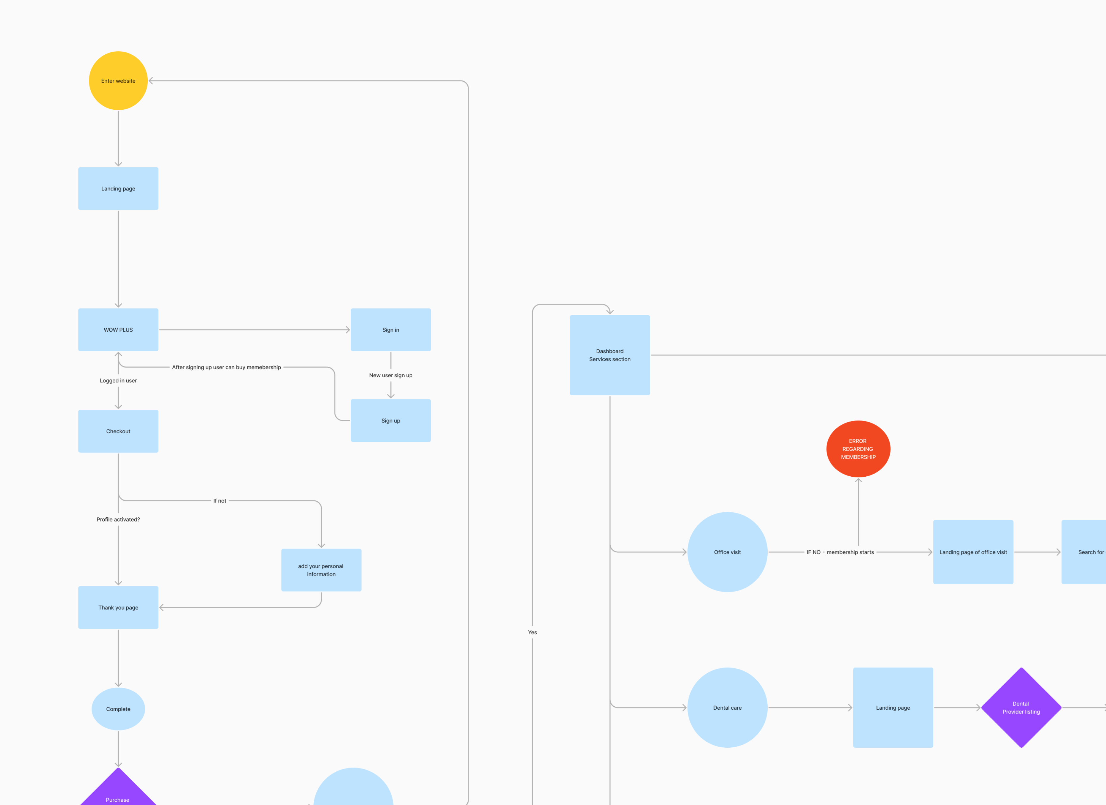
User Flows
Design
Architecture
Prototyping & Test
Launch
Iteration
We thoroughly assessed which features to include and which ones to skip. We employed the MoSCoW prioritization model to categorize features into "Must dos" and "Would-love-to dos.
After the finalizing the Information Architecture, we moved on to carving out a simplified the process of creating and managing agreements. Along with the additional features of creating and managing individual entities.
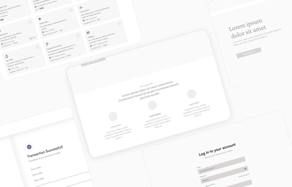
The wireframes were created using combination of user research and feedback from the stakeholders
The Persian Rose color and a clean sans-serif typeface for establishes a professional, simple aesthetic for the product and ensures a pleasant feeling to the user.
A well developed menu section was necessary to help the user engagement.

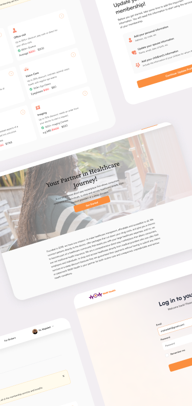
A comprehensive Dashboard layout for healthcare benefits and services.
A comprehensive Dashboard layout for healthcare benefits and services.
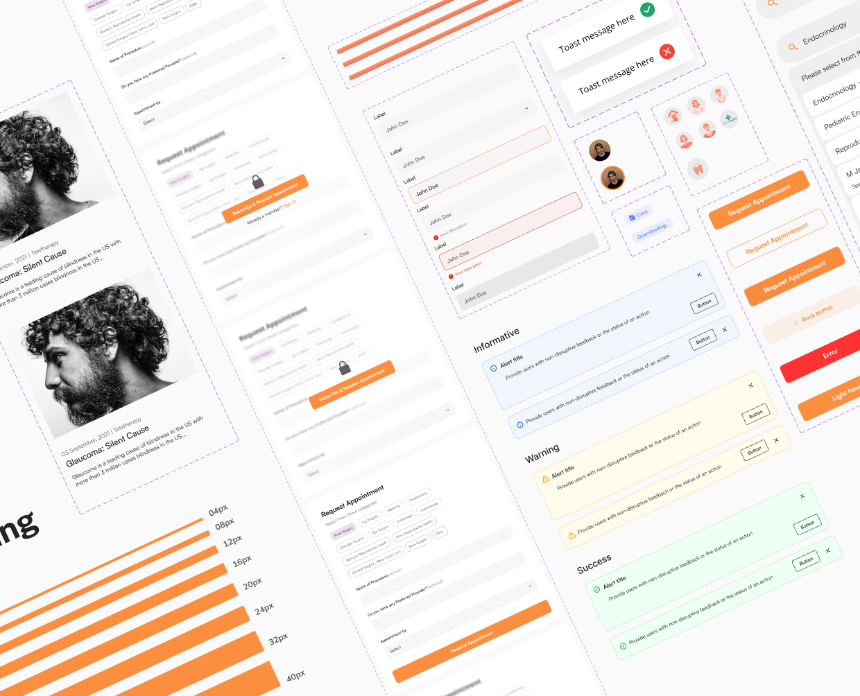
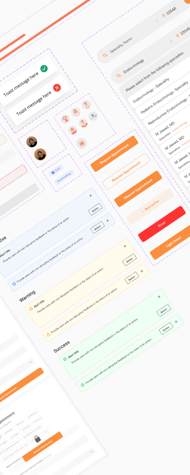
It’s a breeze to assemble new pages from blocks and components
